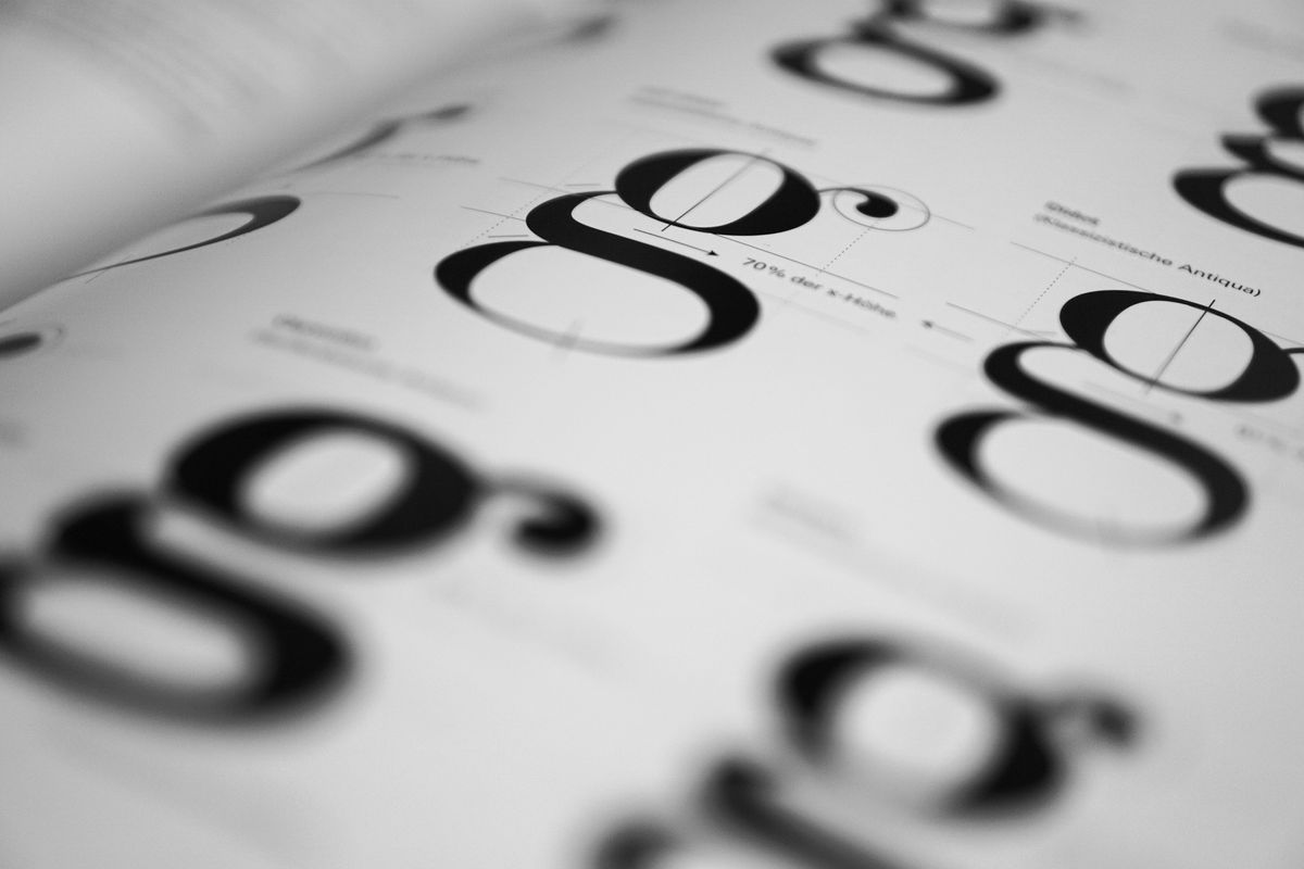
Typography is one of our favorite art forms and our team often spends hours working to find the most unique fonts for our designs. Here are three ways team Ridiculously Efficient ensure our font choices are a home run.
1. Show character with color.
To save yourself in the end, start with your colors. This way, you can view the fonts you choose in the respective color palette. If you find your favorite font and it doesn't look so good with your brand's theme, it will be heartbreak and, potentially, hours of wasted time.
Next, look at your your design's imagery and see if there are certain colors, shades or tone that appear repetitively.
Distinct shades, varied hues, compelling contrasts—each one affects the eye differently, telling the world a particular story about who your brand is. It does not matter what your brand's vision is, there’s a beautiful color scheme that can display exactly what you want it to, just dig for it!
When it comes to typography, too many colors can blur the message. Search for two complimentary colors that anchor your design, then vary your hues for an occasional accent or to add additional colors beyond your two leading colors.
2. Pair fonts as perfectly as wine and cheese.
Some font pairings create a beautifully harmonious look, just like wine and cheese. If you’re using a clean and simple sans serif font, play with your styling and try pairing it with something like an ornate, serif font.
Thin, skinny, and intricate fonts contrast amazingly with bold fonts. Each font has its own personality and adds different voices to the conversation, so choosing the perfect combination can be the difference between a spectacular performance, and a confusing and annoying attention competition.
Although we hate rules and prefer to do design our way, it’s best not to have more than two fonts throughout your branding. Like most designs, but especially when it comes to typography, less really is more. When you only use two complementary font choices, you make your design easily readable, and you are able to tastefully highlight your key points.
3. Complement your content.
Just like how your outfit says everything about your style, the same applies to your typography choices. Everyone wants to look good when they're stepping out the door, and the same is true for your font choices. It is important your design complements the objectives of the work's purpose.
Did you know that every font family is created for a reason? Next time you are choosing the perfect font for your design, take a moment and really compare your design's theme with a complimentary font style. This can tell you a lot about the fonts and if they belong together. Sometimes the fonts that we "like best" are not necessarily the "best fit."
When selecting a font, ask yourself the following questions to help narrow down the thousands of choices that will fog your decision making:
- What's your brand's mission?
- Who is your design trying to target?
- What’s their age?
But remember, the most important rule is that it must appeal to your unique audience.
To find the right font for your design, try using Typekit or Google Fonts libraries to easily find a font that will match your brand's unique style.


Member discussion